- RadioActive
- Moderator
 Offline
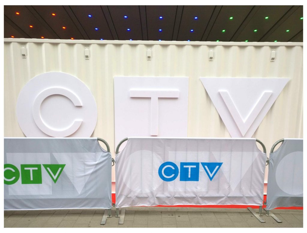
CTV Unveils Redesigned Network Logo
The longtime multicoloured CTV logo (the red "C", the blue "T" and the green "V" lettering) appears to be going away. TV freelancer Bill Brioux points out on his site that the network has unveiled a new look that viewers will soon be seeing, and takes away all those conflicting colours.
It's the latest attempt at coordination by Bell, which recently announced the rebranding of several cable channels to include the "CTV" name.
(Pic below is courtesy of Brioux's site. If you've never looked at it, it's well worth a visit.) 
- betaylored
- Member
 Offline
Re: CTV Unveils Redesigned Network Logo
mike marshall wrote:
That's better. Bland.
Capital B on the bland indeed mike marshall, perhaps they did this because it's cheaper?
Could they use it somehow involving a blue screen effect for promotions, maybe as part of a jazzy new ad campaign with their tv commercials. If the shade was as distictive as say the blue Birks is known for, a single colour might have worked.
As things stand, it's a very sucessful re-blanding.
Last edited by betaylored (June 12, 2018 6:54 pm)
- LOSat
- Member
 Offline
Re: CTV Unveils Redesigned Network Logo
Well they seem to be on Re-blanding kick right now
CTV SciFi
CTV Comedy
CTV Drama
CTV Life
It all fits together bland on bland.
 1 of 1