 1 of 1
- RadioActive
- Moderator
 Offline
Great Moments In Terrible TV News Set Designs
I noticed this over the weekend while passing by a WIVB-TV Buffalo early morning newscast. Take a close look at the top middle area of the screen, where it says "Certified Most Accurate."
Why is there a tall grey metal pole blocking the letter "t" in Most? I can't believe they did this on purpose but obscuring part of an on set graphic for a completely useless and frankly ugly piece of steel makes me wonder if there wasn't any other way to configure this set.
It looks ridiculous and makes no sense. Yet there it was. If I remember, I'll check this weekend to see if they do it again. What an odd choice to put that on the air. I find it hard to believe it was deliberate, and why they didn't fix it. 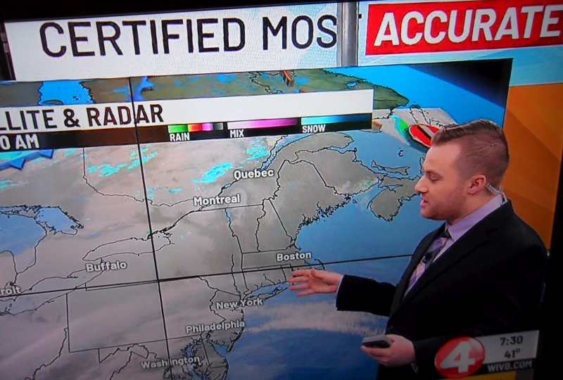
- newsguy1
- Member
Offline
Re: Great Moments In Terrible TV News Set Designs
Maybe they are using urban slang... like Mos Def. (most definitely if you don't know)
Last edited by newsguy1 (April 25, 2024 7:49 pm)
- DX
- Member
Offline
Re: Great Moments In Terrible TV News Set Designs
Buffalo has a sizeable Polish community, so maybe he was lined up for the Certified Pierogis.
- mace
- Member
Offline
Re: Great Moments In Terrible TV News Set Designs
newsguy1 wrote:
Maybe they are using urban slang... like Mos Def. (most definitely if you don't know)
I didn't know. Thank You.